
A deep dive on router performance – Providing data insights to help our business partners predict trends
In 2020, eero (Amazon’s Wi-Fi company), started to grow its business sector with Internet Service Providers (ISPs). My team provided a tool for ISPs to track the status of a customer’s eero Wi-Fi system. This tool reduced the length of customer calls and reassured happy customers.
Timeline
Aug-Nov 2022 (4 months)
Success metrics
Avg. of 4k views per month
Role
Sole UX designer in a 7-person team
Responsibilities
I directed the product vision and handled end-to-end design for this feature. During this project, I oversaw the visual work of a junior designer, and I collaborated closely with Internet Service Providers, conducting user research and testing.
Product ChallengeInternet Service Providers (our business partners) had a limited view into their end-customer’s Wi-Fi network performance.
Internet Service Providers (ISPs) played a crucial role in eero's business growth by selling our routers to their end-customers. The agreement was that these end-customers would contact their ISP for support in case of connectivity issues. During that period, ISPs utilized eero Insight, our B2B platform to manage their customers' networks. However, this platform only displayed real-time data of these networks and lacked information on the network's overall performance.
Product SolutionWe gave ISPs a Wi-Fi performance analytics tool to track and diagnose their customers’ Wi-Fi health over time, addressing slow connectivity effectively.
Similar to Google Analytics, we developed a Wi-Fi analytics tool to aid Internet Service Providers in identifying primary sources of slow connectivity and assessing eero router performance. When customers report slow Wi-Fi, ISP support agents can better determine if it's an ongoing issue and provide a more accurate resolution.
Product Deep DiveInternet Service Providers wanted to monitor potential changes in eero router performance over time to help them identify any issues.
Identifying issues for end-customers was important for Internet Service Providers because it boosted their reliability. At the time, eero Insight only displayed real-time statuses, which is only when a customer’s Wi-Fi network is healthy. However, in instances where the Wi-Fi signal abruptly dropped, frustrated customers would reach out to ISP support agents, who weren’t equipped with how severe the issue was.

Meet Guy, a support agent working at ACME, an Internet Service Provider. When he receives calls about slow Wi-Fi performance, he doesn't have context for the situation.
When Guy doesn’t have context about a situation, the call usually runs longer. Support agents like Guy spend an average of 10 minutes getting more context from the user, asking them how long they have experienced slow Wi-Fi performance.

To assist support agents like Guy, I proposed a way to show the customer’s Wi-Fi performance on eero Insight.
To provide valuable context for support agents like Guy, I suggested implementing a timeline approach. This would reveal the duration of time the customer's Wi-Fi connection has been slow, eliminating the need for extensive questioning during the support call and streamlining the troubleshooting process.
In my research on Wi-F products, I saw two main visualizations in displaying Wi-Fi performance.
Table chart - Effective for comparing raw data
Pro - Provides a visual representation of Wi-Fi performance trends over time, making it easier to identify patterns or anomalies.
Con - While trends are visible, specific numerical values may not be as apparent, requiring additional data points or annotations for precision.
Line graph - Effective for identifying change in data set
Pro - For agents who prefer organized information, tables offer a clear and structured presentation of data, minimizing potential misinterpretations.
Con - Less visually intuitive compared to line graphs, requiring users to spend more time interpreting the presented data.

Initially rejected, my proposal to implementing a line graph - a new component - gained approval after alignment with a long-term product vision.
Using the line graph seemed like the best course of action for two reasons – allowing support agents to see a bigger picture and quickly identify patterns in their fast-paced working environment. Because this would be a new component, leadership felt implementation would be costly. I presented this concept to existing support agents, and they felt more confident in understanding Wi-Fi performance over time with the line graph.

Identifying Wi-Fi slowdown wasn't about isolating a particular eero router; instead, the focus was on understanding why its internal hardware, specifically the radio, was underperforming.
When a user has three eero routers at home, connectivity issues often arise from communication between these routers rather than a single router. So, it's more important for support agents to check the "environment" created by these routers' signals.

A dropdown menu provides a streamlined and organized method for accessing specific options when addressing Wi-Fi issues at a specific point in time.
Another challenge was deciding how a support agent would interact with the line graph to view the desired level of granularity. Engineering had concerns with the zoom in/out approach due to lag and an increase in scope.
Manual selection – Granularity adjusts within preset time frames
Zoom in/out— Granularity adjusts within margins in real-time
Scrolling— Fixed granularity extends beyond margins

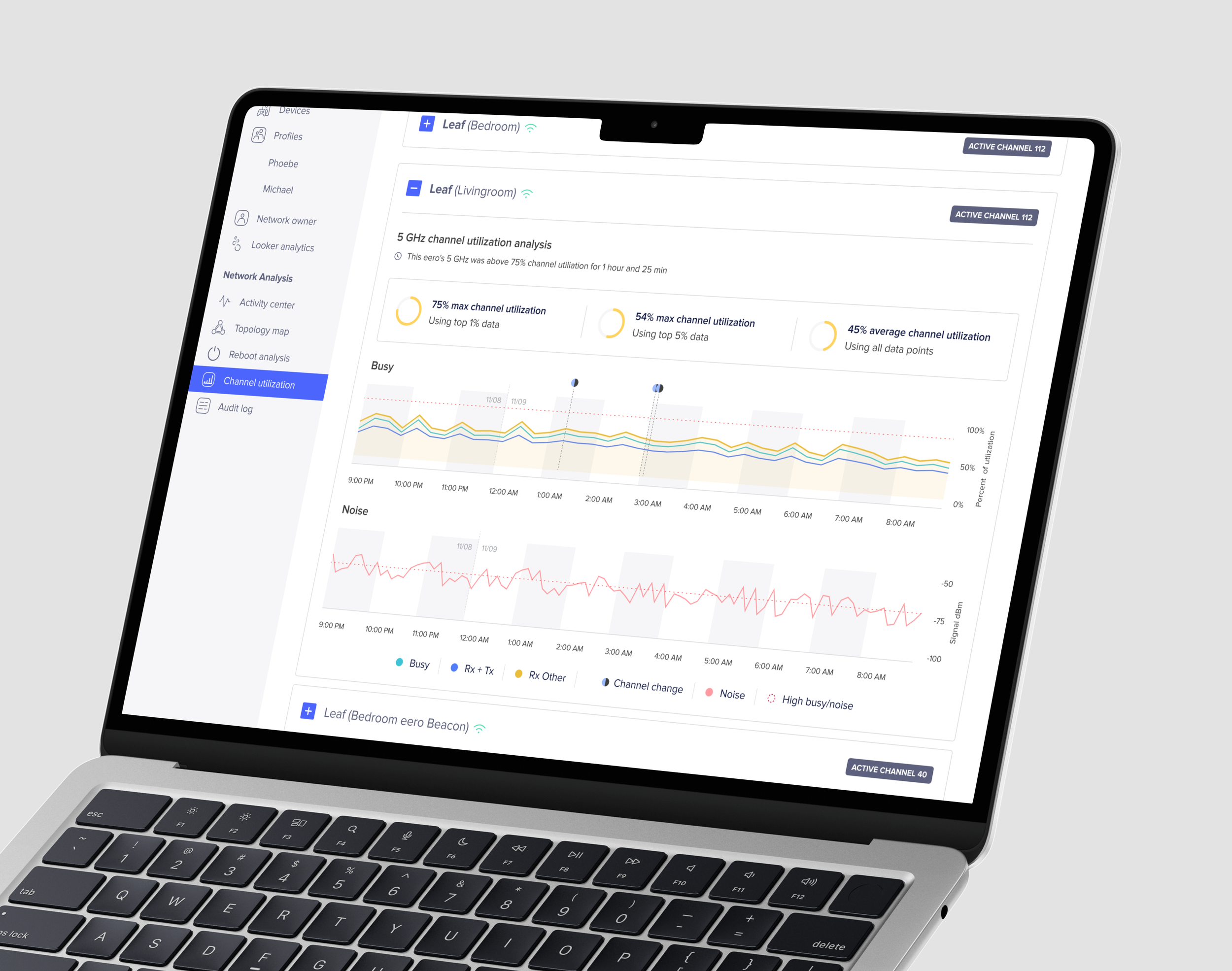
Using the full-length line graph maximized the horizontal screen space.
After exploring different options, I decided to use full-length line graph to maximize the horizontal screen space. Support agents found this view favorable as their typical workflow involves managing multiple windows simultaneously, often with reduced sizes on a single screen.

Separating data trends that used different measured units helped agents digest information.
Initially, I aimed to depict Wi-Fi performance trends on a single graph. However, after some explorations, I decided to separate it into two distinct components: busyness, representing the router's bandwidth, and noise, indicating the interference experienced by the router. This separation was due to their different measured units.
A router’s busyness level uses a percentage %.
A router’s noise level uses dBm (decibel milliwatts).

Internet Service Providers feel overwhelmed and compelled to skim the screen due to visually presented repetitive information.
I conducted 20+ moderated usability tests to evaluate the existing troubleshooting experience — starting from receiving a support call to investigating the Wi-Fi performance.

Yellow and red colors are used to for busyness and noise levels because they signal as potential issues when there are spikes.
A support agent’s workday often involves multitasking, so reducing the amount of overhead to read trends quickly was important.
Addressing his color-blindness, I used visual elements to define semantics instead of relying heavily on color. For example, I used a horizontal line to depict the radio's activity threshold. When the activity line exceeds this threshold, it's evident that the radio is overworked.

Wi-Fi performance analytics tool launch
With the Wi-Fi performance analytics tool, support agents have better insight into a user's Wi-Fi network environment. Accessing this data through eero Insight enables them to streamline the resolution of ongoing connectivity issues.
“Huge fan of the new channel utilization and explanations. Balancing depth and ease of understanding is hard. They tend to get it right. ”
– Trustpower (Internet Service Provider)

Web platform - ISP agents can identify poor router performance through ratio performance and provide a more accurate diagnosis.
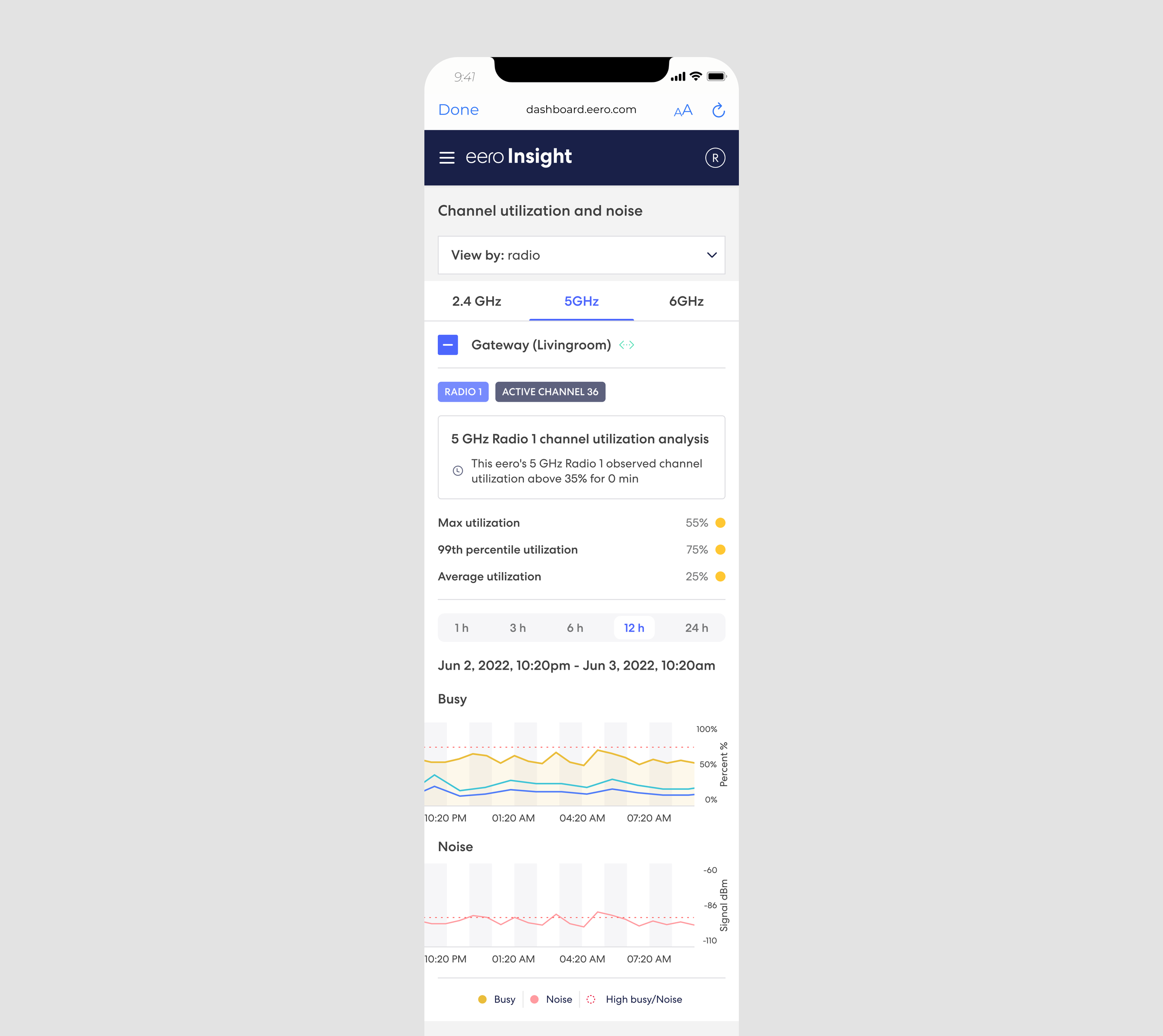
Mobile platform - Pro-installers (Technicians who are sent by ISPs to a customer’s home to set up their Wi-Fi network) can use their mobile phone to easily monitor a customer’s Wi-Fi network right after setup.
Achievements & closing thoughts
As the lead designer, I was in a 8-person core team and spent 2 months shaping product requirements and spearheading designs. We shipped Network Channel Utilization in eero Insight for our business partners in January 2023 and in the consumer app in February 2023.
During this project, I learned to be intentional about my time —
Moving fast in the beginning— I kicked off the project by sharing sketches early on with my product manager and engineering team. During this process, I realized that implementing the zoom in/out feature for the line graph was unfeasible within the project's scope, enabling me to pivot and save time.
Allocating a buffer time— In the my project timeline, I added a two-week buffer period to anticipate iterations from feedback. The buffer time became useful when refining the line graph into an official component and multiple stakeholders became involved.
Credits
The launch of this Wi-Fi troubleshooting feature wouldn’t have happened without my core team: Ben Lowe (Product), Mugdha Kulkarni (EM), Jean Sandrin (iOS), and Natalia Cabral Silva Ferraz (iOS), Gilvan Gomes (Android), James Chou (Android), Yue Kang (Cloud). Other contributors include our business partners (ISPs) for providing valuable and iterative feedback.