

eero’s app redesign after its acquisition – A new scalable app for a growing customer base
When eero (a Wi-Fi company) became a part of Amazon, we suddenly saw more users who were not familiar with setting up Wi-Fi at home. Our app was technical and had trouble scaling to hold new, anticipated features. This is the story of the eero app’s overhaul.
Timeline
May-Nov 2019 (8 months)
Success metrics
4.5+ star ratings on App and Play store
Role
As a supporting UX designer, I worked with a core team including a Senior UX designer, a PM, and four engineers.
Responsibilities
I contributed to the end-to-end design process and developing a new design system.
Product Challenge After Amazon’s acquisition of eero, we saw a growth in average consumers using our technical-heavy product.
When I first joined eero, a mesh Wi-Fi company, 90% of our customer base consisted of tinkerers and the tech-savvy. Post-acquisition, we saw a growing interest in our product from the average consumer because of our simple and sleek eero router design. However, our old eero app was difficult to navigate because of technical jargon and poor feature findability.

Product SolutionI collaborated with my team to overhaul the eero app, addressing overdue tech debt and enhancing the user experience for a technical-heavy product.
Our team looked into mild-to-wild approaches with surfacing existing features that customers wanted but had a hard time finding in the app. The “wild” approach of overhauling the app was green-lit after I presented to leadership that it would save the business money by addressing four years of tech debt.

Product Deep DiveRepaying tech debt came in many forms, starting off migrating to Figma to streamline design’s hand-off process with engineers.
The old design system had poor, scattered documentation owned by designers who had left the company, so at the time I made my best judgement on how specific components were used. At the time, we were updating components on Sketch and uploading it on Zeplin to have new assets uploaded. This was tedious and eventually lacked consistency between the two platforms.
This challenge led the team to migrate our entire library and designs from Sketch to Figma, where we cleaned up our design system. Whenever we update an asset, our engineers can immediately see it on Figma.
Migrating to Figma inspired a more collaborative environment, where I worked with engineers to design a new app infrastructure.
The old app infrastructure had a hierarchical infrastructure that hid existing features. Customers called in and posted on Reddit to ask for Wi-Fi features that already existed in the app, which also increased business cost. Looker (our data analytics tool) also confirmed that highly-requested features had low adoption rates.
To close this gap, we initially looked into moving these features to the forefront, but that crowded the main screen. Later, we worked with engineers to brainstorm other infrastructure possibilities. In evaluating the trade-offs, the flat navigation aligned with our product vision the most.
Flat navigation - This approach uses menu tabs
Pros - This infrastructure is commonly used in both iOS and Android that offers a clean approach to segmenting features in an app. It’s used by apps like Music and App Store.
Cons - The structure is limited by the horizontal space on the screen. Most apps use no more than 5 tabs in their app.
Contextual navigation - This approach may use floating, unconventional buttons
Pros - This infrastructure is flexible and would allow us to make Wi-Fi more exciting for users who are new to Wi-Fi.
Cons - Its non-modular nature would require more engineering resources and coordination to keep interactions consistent.

Secondly, to cut down on tech debt, I worked on creating some components in our new design system using the standard 8px grid.
Moving from a hierarchical to a flat navigation revealed spacing inconsistencies, prompting us to integrate the 8px grid system. In addition, during my user research process, we noticed that users skimmed details in the app that were visually small, bright, and low in contrasst.
To address this, we prioritized color accessibility, ensured buttons were no smaller than 14px by 14px, and made efforts to distinguish tappable items from still imagery. Enhancing the app's readability and usability resulted in a reliable experience.

Building trust with customers was just the beginning; it was followed by creating a relatable and personable experience.
We collaborated with the Brand team in discovering the app's new identity. While the technical language in the app wasn't attractive to the average consumer, we understood the challenge of simplifying Wi-Fi terms common in the industry. Instead of just simplifying the language, I explored colorful illustrations to make Wi-Fi more approachable. The rebrand involved conveying the concept of "home" and humanizing the experience by incorporating people into the visuals.
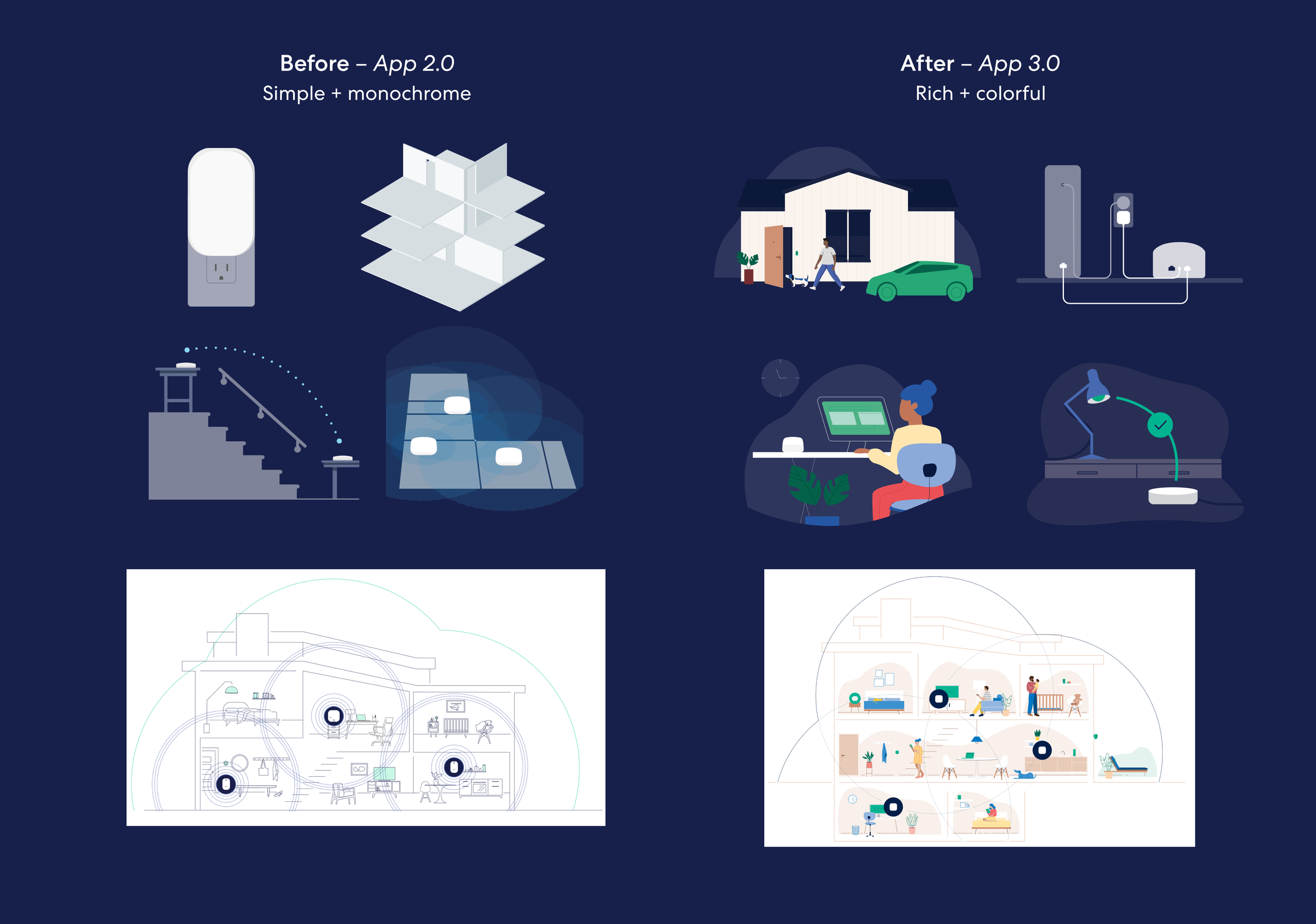
The third strategy involved defining the structure of the new app and where context would be placed so that users could find relevant items together.
Each menu tab was designed as a room, each serving as a space where customers can view, track, add to, and manage their network. The idea of the default tab was to show the user the status of their entire Wi-Fi network and have it separated from the Wi-Fi settings. This was to avoid users from editing their Wi-Fi network and disrupting connection. I specifically worked on building the Discover tab, making paid and advanced features more visible.

Transitioning to high fidelity mockups
Infused with both functional and discovery features, the app prioritizes features that make a mesh Wi-Fi network run successfully. High-value and low-usage features are placed in the context of each menu tab.

We faced challenges of localization during our first global launch, where I worked with engineers to quickly iterate and improve components
In the same year, we anticipated our launch in the European Union Five (EU5) — France, Germany, Italy, Spain, and the United Kingdom. While designing the localized version of the eero app, I learned that most languages had longer strings than English. This was an issue because being in a new territory, our design system then did not define string behavior.
A decision needed to be made regarding whether to wrap or truncate the text. I evaluated the pros and cons of both approaches, ultimately choosing to wrap the text and optimize for transparency.
Pros of wrapped text — Saved costs compared to the process of truncating and ensured transparency to the user.
Cons of wrapped text — Pushed content down vertically, taking up more space.


“App works amazing and the simplicity is something I never experienced in routers. Setup was dead simple”
– eero customer
The new eero app instilled new confidence in customers to managing their Wi-Fi
The new eero app introduces a streamlined, flat navigation menu, ensuring easy Wi-Fi setup and management. This effort has led the team to building a scalable design system and defined a robust hand-off process for new components.
Many of our customers are parents of young children who rely on digital devices, like their iPad, to do homework and play. Although necessary, these customers believe in the need to limit screen time. Parents can now bundle their kid’s Wi-Fi devices under a Profile and schedule Wi-Fi pauses, and monitor device activity happening in their home.

Creating a Profile to manage multiple devices at once

Monitoring device activity to track Wi-Fi performance
Success metrics
The launch of the new eero app came with many challenges, but also big wins. We saw improvements in user retention and individual feature adoption.
Monthly active users — In 5 months after the app redesign, monthly retention increased from 50% to 78% and monthly reactivation increased from 9% to 11%. We saw at least active customers who opened the app each month bump up from 50% to 60%.
Profile adoption in the Home tab — We saw ~35% increase in customers creating their first profile. In 3 months, we increased adoption from ~20% to ~25% of customers with at least one active profile.

Achievements & closing thoughts
As the supporting, I contributed to component creation, product ideation and producing finalized designs. The new eero app successfully launched in November 2019.
By dedicating time to building relationships with my team, I found that it significantly boosted productivity and personal growth.
It takes a village — Many cross-functional teams gave us invaluable feedback early on, such as ideas around accessibility and the North Star. Early collaboration made this project feel a little less daunting and was a great way to gut check our design process.
Be curious—Recognizing others' motivations became a valuable tool. I used to join design reviews thinking “What can I get out of this?”, but learned that catering to my stakeholders and asking “What do the stakeholders want out of this?” helped with the buy-in process.
Credits
The successful launch of the eero app was made possible by James Goode (Senior UX Designer) and Charlie Jacobson (Product), who spearheaded the product vision.
Thanks to the consumer engineering team: Jesse Tipton (iOS), Xuefan Zhang (iOS), Noah Rowlett (Android), Anu Bharadwaj (Android). Other contributors include Cloud, Connectivity, Customer Support, Brand, and Marketing teams.